
 rotiV3
b79ac87418
rotiV3
b79ac87418
|
8ヶ月前 | |
|---|---|---|
| .. | ||
| lib | 8ヶ月前 | |
| .signature.p7s | 8ヶ月前 | |
| Material.Icons.WPF.2.0.0.nupkg | 8ヶ月前 | |
| README.md | 8ヶ月前 | |
README.md
Material.Icons
Parsed icons set from materialdesignicons.com and display control implementations for different GUI frameworks.
- All icons are always up-to-date because automatically updated every 6 hours.
- Small package size because icons are graphically encoded via SVG Path.
- Icon types are strongly typed enum, so your IDE will suggest available variants:
Structure
This project consists of 3 parts:
-
contains info about the icons
-
contains controls for AvaloniaUI
-
contains controls for WPF
-
FAQ - frequently asked questions
Avalonia
Getting started
- Install Material.Icons.Avalonia nuget package:
dotnet add package Material.Icons.Avalonia - Include styles in
App.xaml(for2.0.0version and higher):<Application xmlns:materialIcons="clr-namespace:Material.Icons.Avalonia;assembly=Material.Icons.Avalonia" ...> <Application.Styles> ... <materialIcons:MaterialIconStyles /> </Application.Styles> </Application>For
1.*.*:<Application ...> <Application.Styles> ... <StyleInclude Source="avares://Material.Icons.Avalonia/App.xaml" /> </Application.Styles> </Application>
Using
Add Material.Icons.Avalonia namespace to the root element of your file (your IDE can suggest it or do it automatically):
xmlns:materialIcons="clr-namespace:Material.Icons.Avalonia;assembly=Material.Icons.Avalonia"
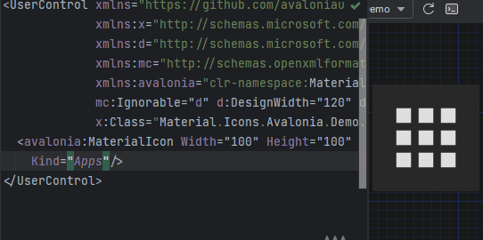
Use MaterialIcon control:
<materialIcons:MaterialIcon Kind="Abacus" />
The Foreground property controls the color of the icon.
Also, there is MaterialIconExt which allows you to use is as the markup extension:
<Button Content="{materialIcons:MaterialIconExt Kind=Abacus}" />
WPF
Getting started
Install Material.Icons.WPF nuget package:
dotnet add package Material.Icons.WPF
Using
Add Material.Icons.WPF namespace to the root element of your file (your IDE can suggest it or do it automatically):
xmlns:materialIcons="clr-namespace:Material.Icons.WPF;assembly=Material.Icons.WPF"
Use MaterialIcon control:
<materialIcons:MaterialIcon Kind="Abacus" />
The Foreground property controls the color of the icon.
Also, there is MaterialIconExt which allows you to use is as the markup extension:
<Button Content="{materialIcons:MaterialIconExt Kind=Abacus}" />
Meta
Getting started
Install Material.Icons nuget package:
dotnet add package Material.Icons


Using
Icon types stored in Material.Icons.MaterialIconKind enum.
We can resolve an icon path by using Material.Icons.MaterialIconDataProvider.GetData().
FAQ
How to change icon color?
- Change
Foregroundproperty.
How to update icons?
- You can manually set
Material.Iconspackage version in your project file.
What about versioning policy?
- We use semver.
Any package with identical major and minor versions is compatible.
For example,1.0.0and1.0.1are compatible, but1.0.0and1.1.0might not be.